WoofMe
An easy platform to find ideal playmates for your dog.BACKGROUND
This project was created for the Digital Product Design class at Pratt Institute with a team of four passionate ux researchers and designers. Given the circumstances of the pandemic, we have collaborated remotely throughout the process, from initial ideation, remote user testing, to the completion of the final prototyping.
REMOTE TEAMMATES
Aichen Guo, Wuke Zhou, Zhichun Zhao
REMOTE TEAMMATES
Aichen Guo, Wuke Zhou, Zhichun Zhao
ROLE
User Research and Interviews, User Journey Mapping, Competetive Analysis, Wireframing, Information Architecture, UI Guide, Prototyping, Usability Testing, Creative Direction
TOOLS
Figma, Miro, Lots of Zoom meetings
DURATION
3 months
TOOLS
Figma, Miro, Lots of Zoom meetings
DURATION
3 months
Making new 🐶 friends can be tricky.
Just like humans, dogs have certain preferences when it comes to their playmates, the size, the personality, or the vibe🔮 in general... As busy and stressful as life gets😪, dog owners have a hard time finding suitable hangout buddies🦋 for their dogs, especially during the pandemic, when safety concerns and social interactions have been changed drastically.
User Needs
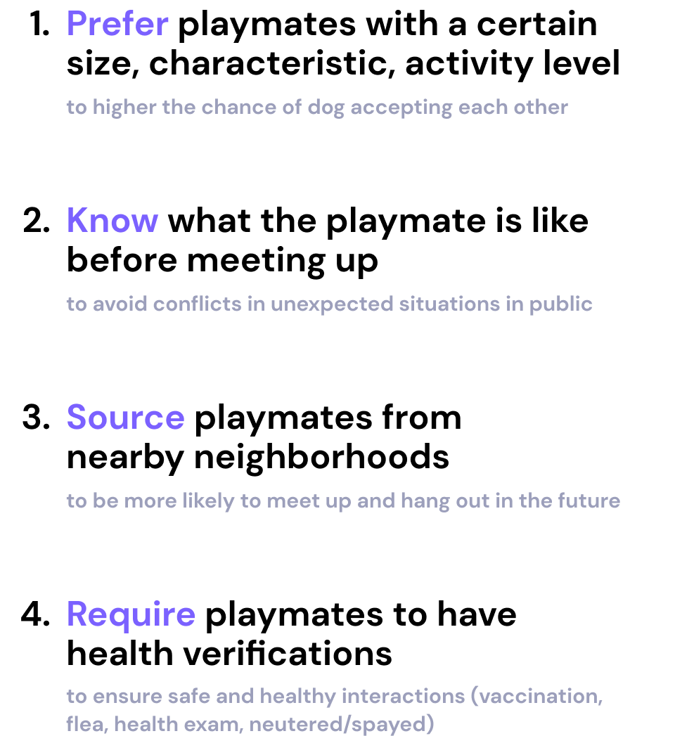
After Doing user research through 8 user interviews, we discovered 4 key needs dog owners are demanding when looking for doggie friends.
How might we make finding playmates easier
while promoting social interactions between...
![]()
How might we make finding playmates easier
while promoting social interactions between...

Solution

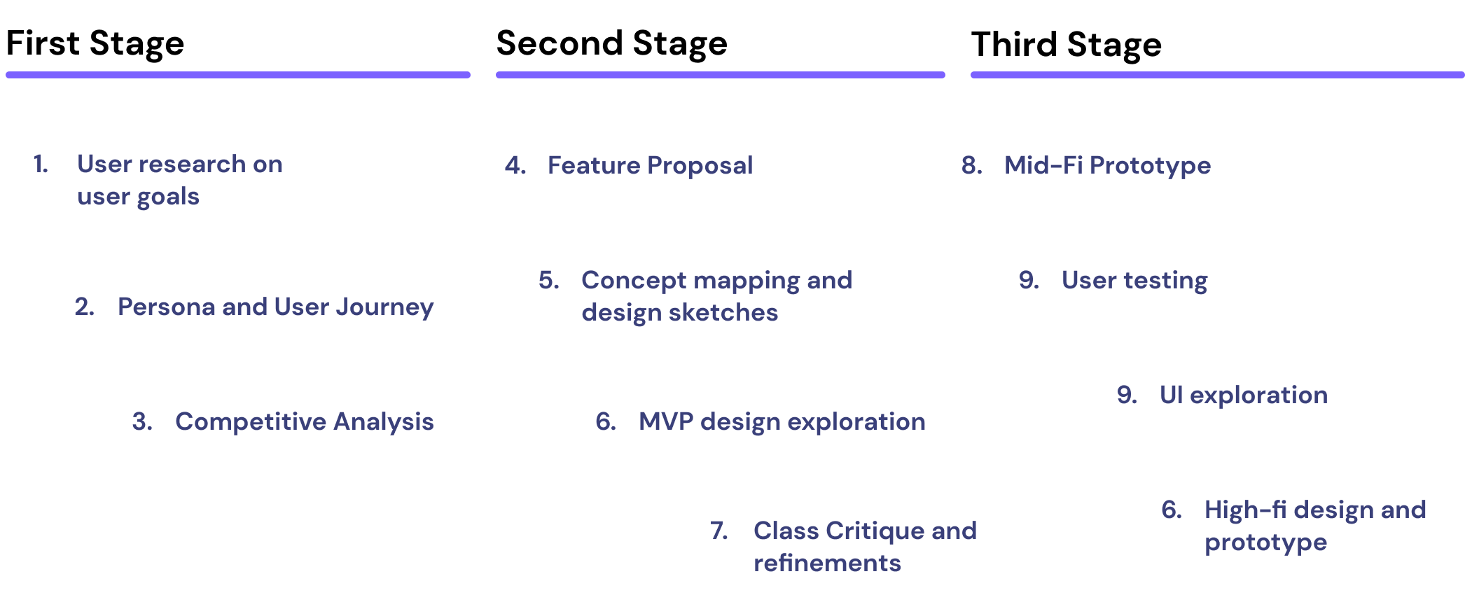
Design Process
Persona

Features
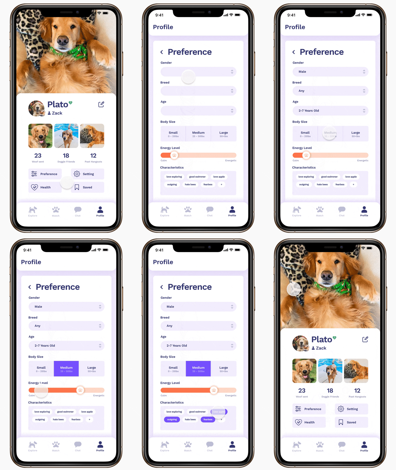
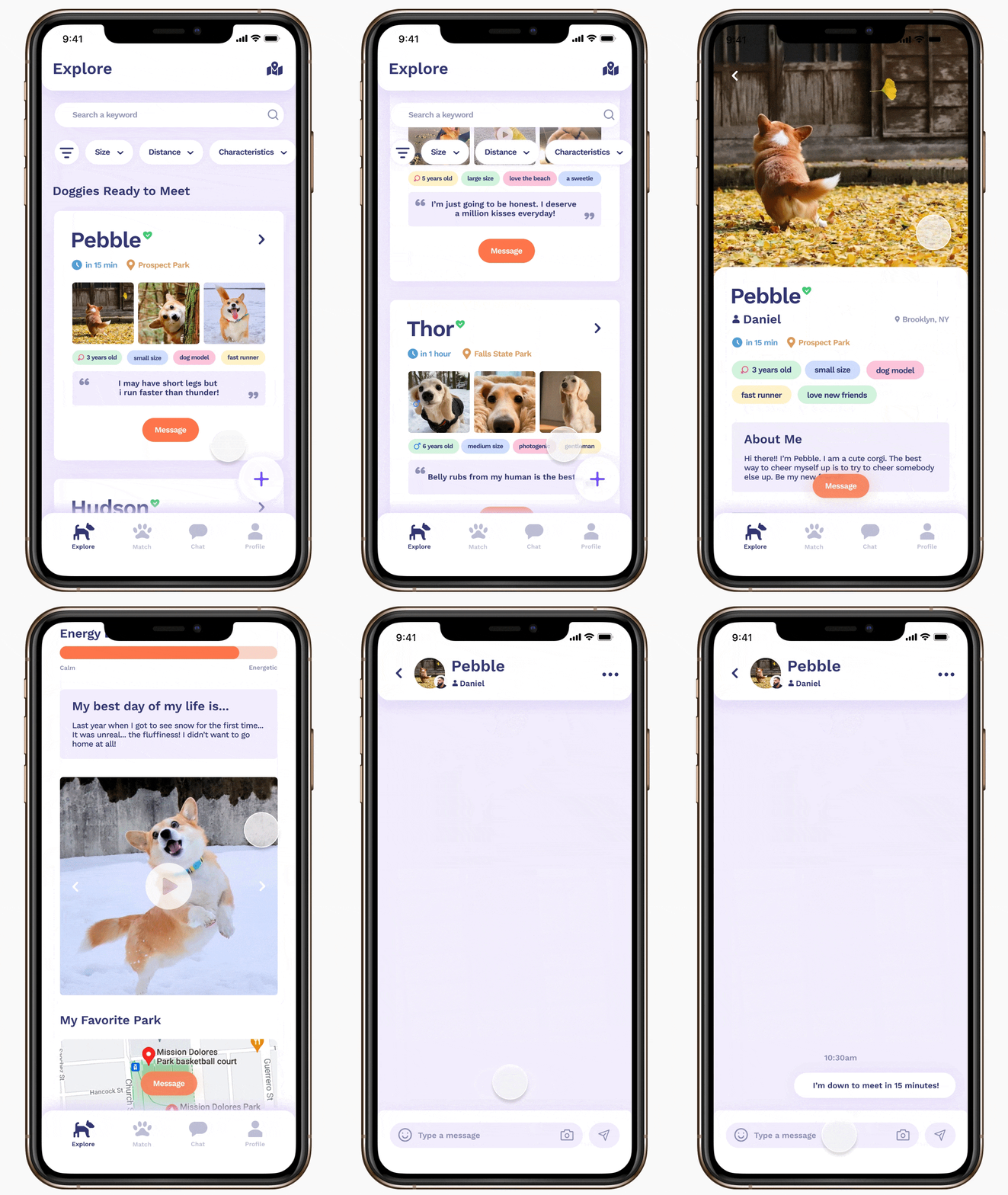

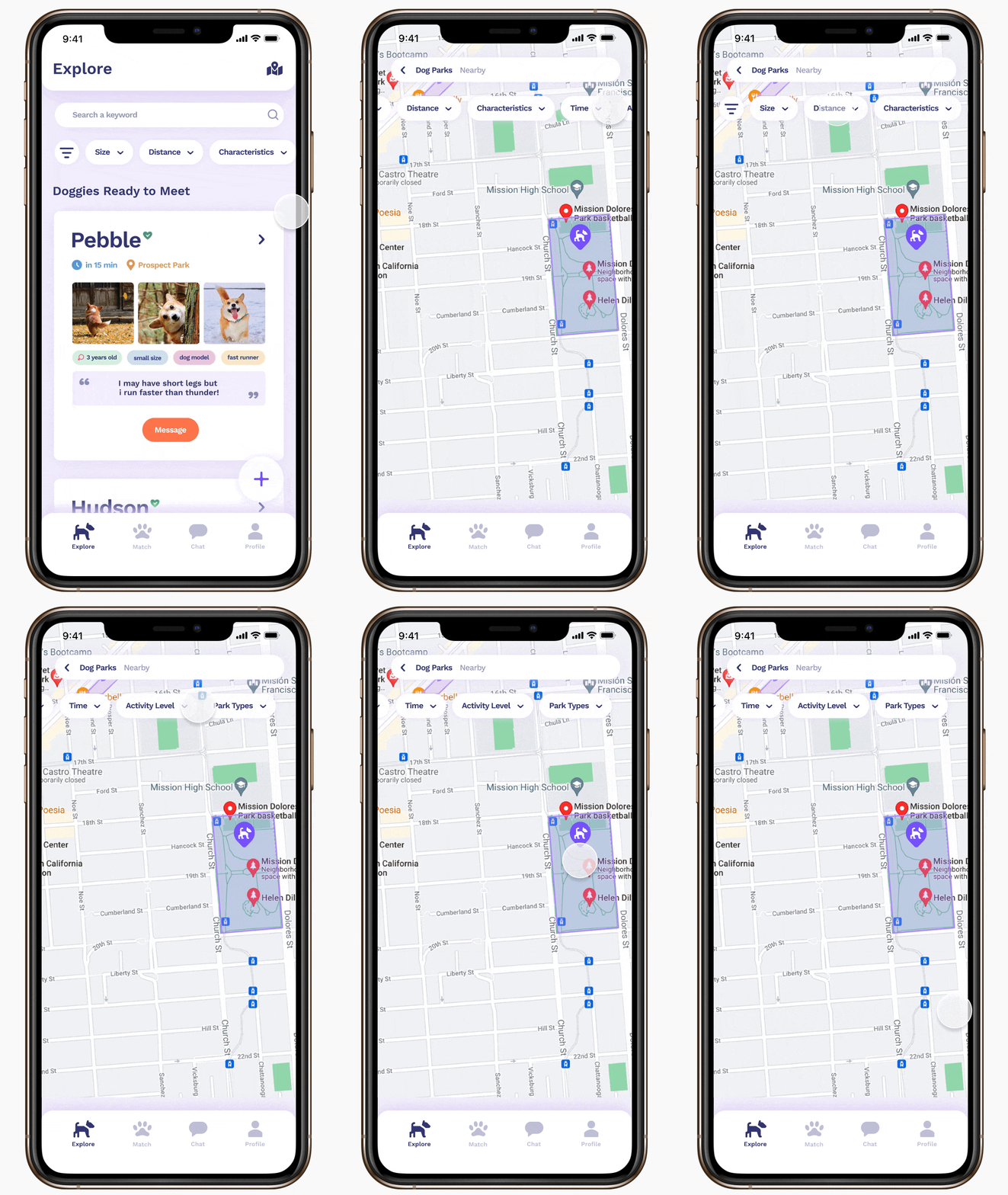
UI Design
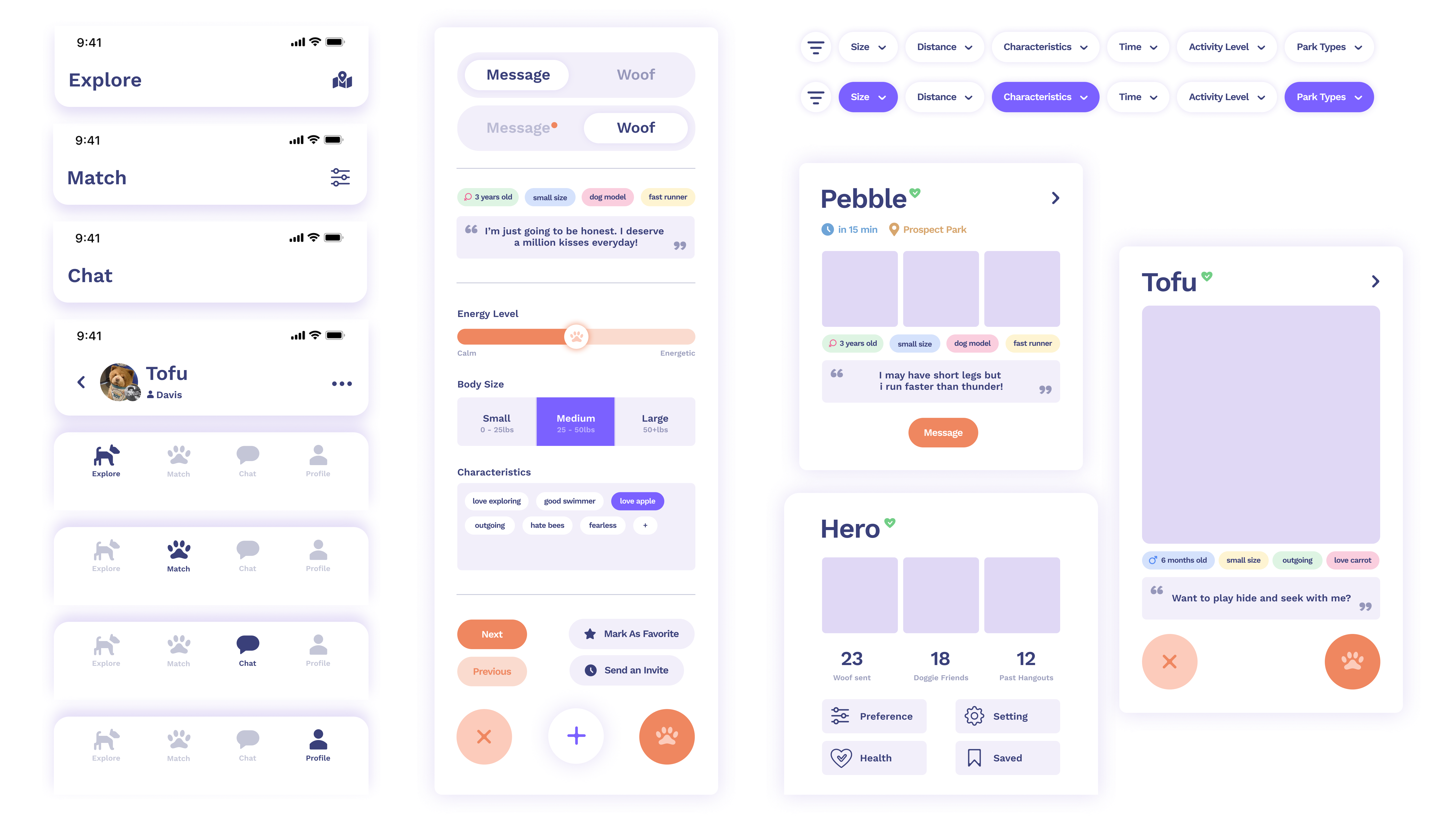
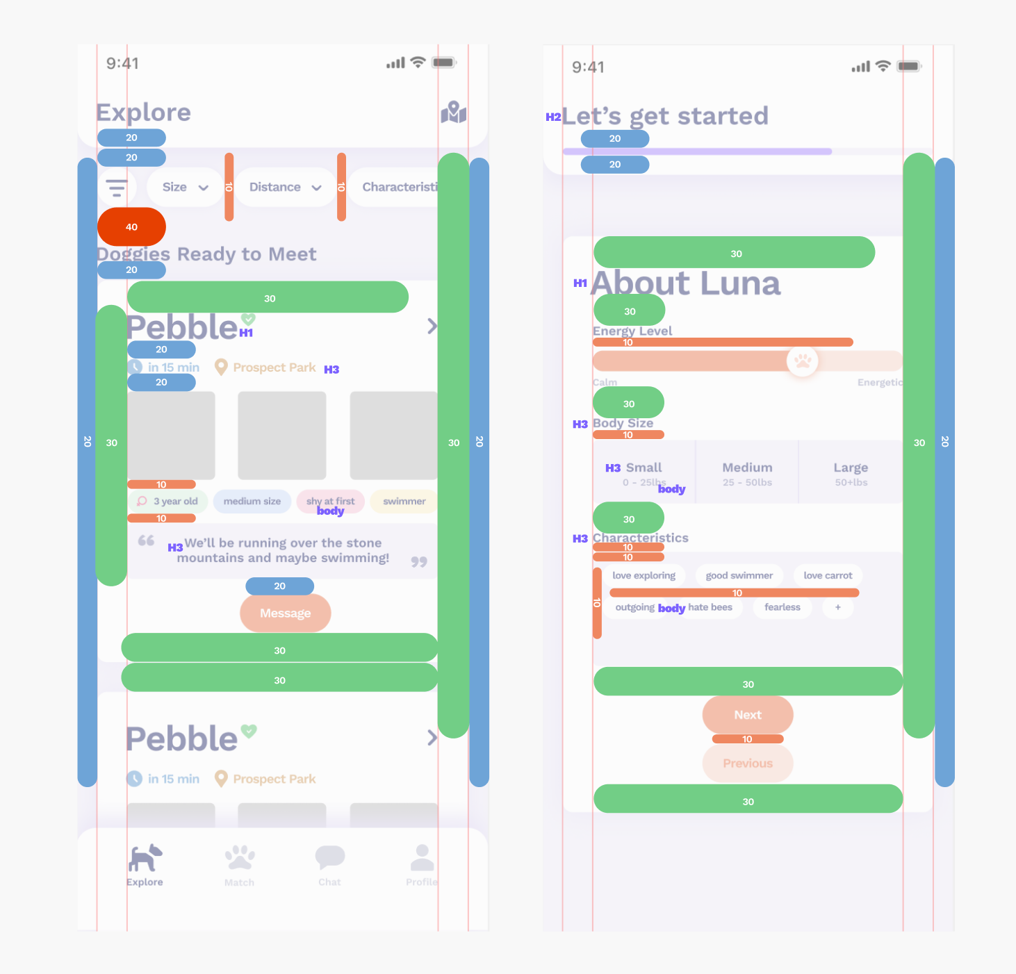
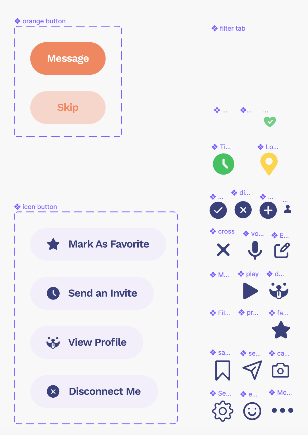
Part of my role was to set up a design style guide along with UI components and icon assets in Figma for my teammates to use conveniently.
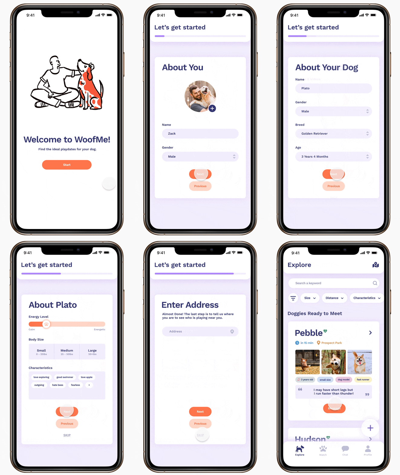
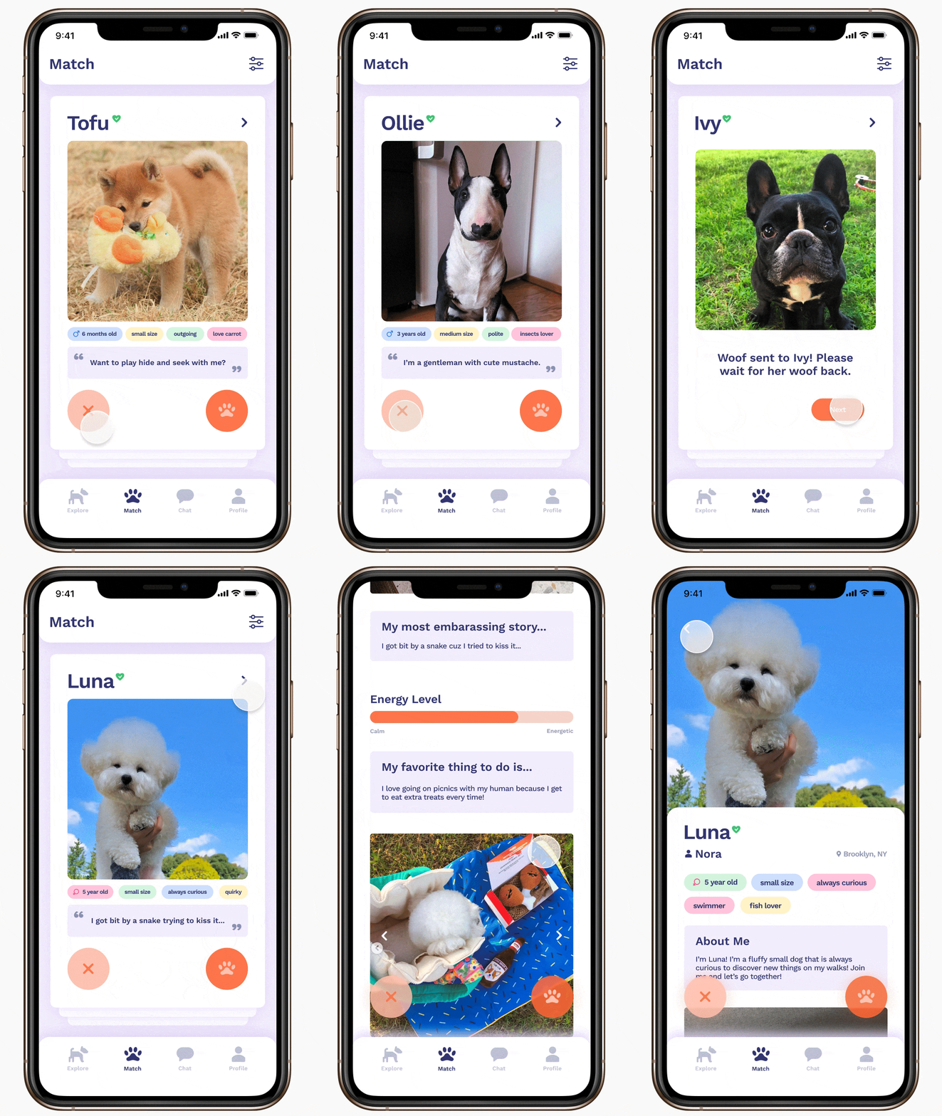
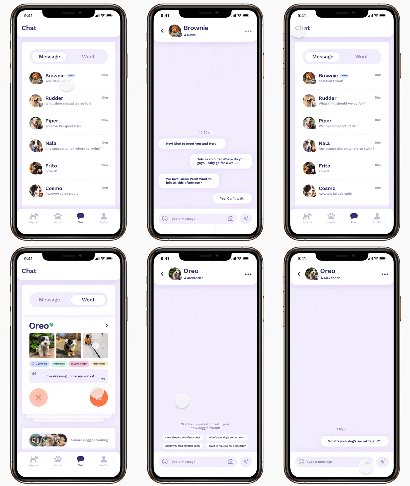
For our user interface, we went with a light and fun style since this is an app for finding friends for your baby dogs. We replaced the traditional icons with doggie elements such as the explore icon with the dog walking as well as the like icon with the little paw. Overall it is very airy and fresh.
For our user interface, we went with a light and fun style since this is an app for finding friends for your baby dogs. We replaced the traditional icons with doggie elements such as the explore icon with the dog walking as well as the like icon with the little paw. Overall it is very airy and fresh.
User Insights and Refinements
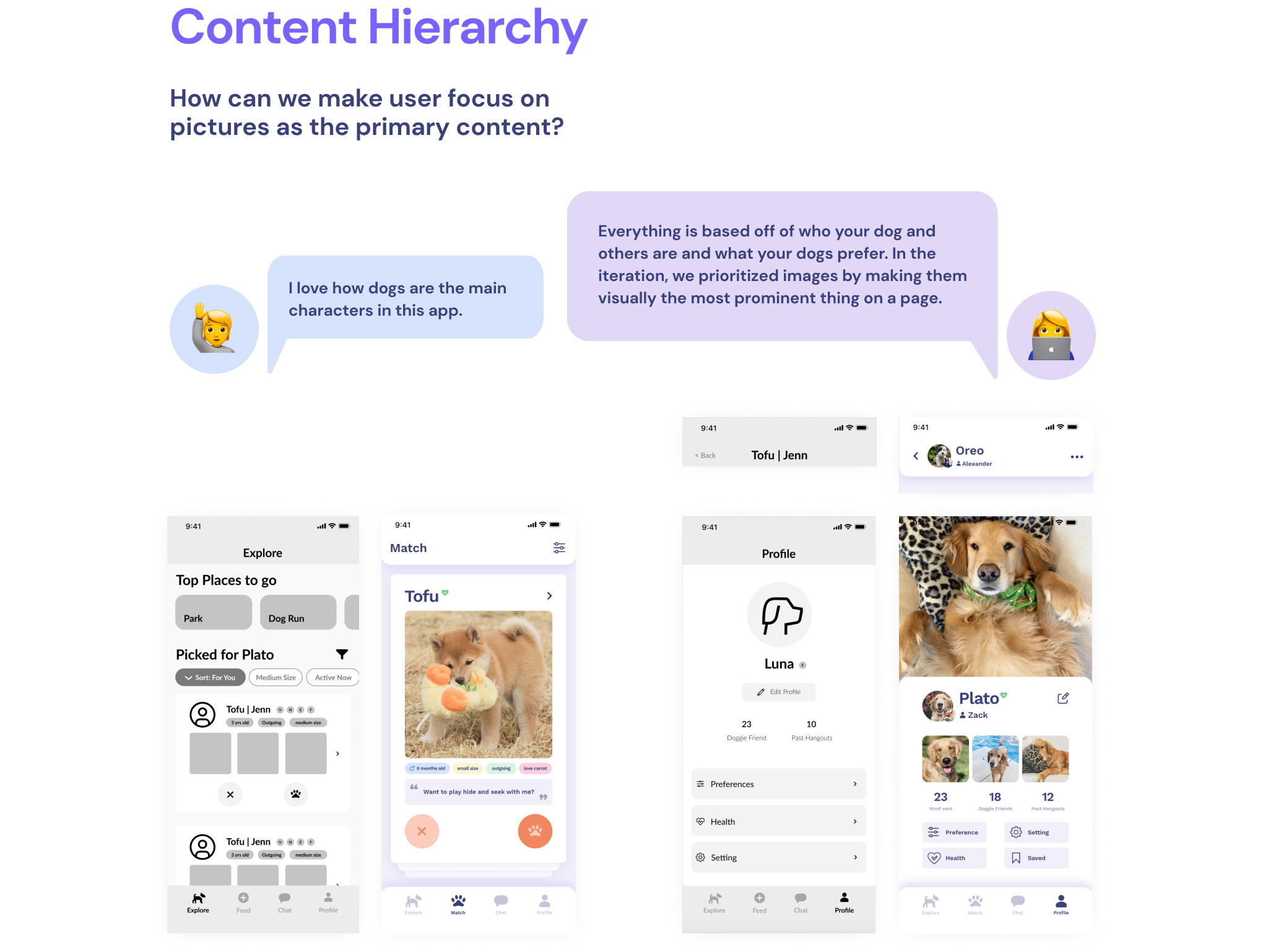
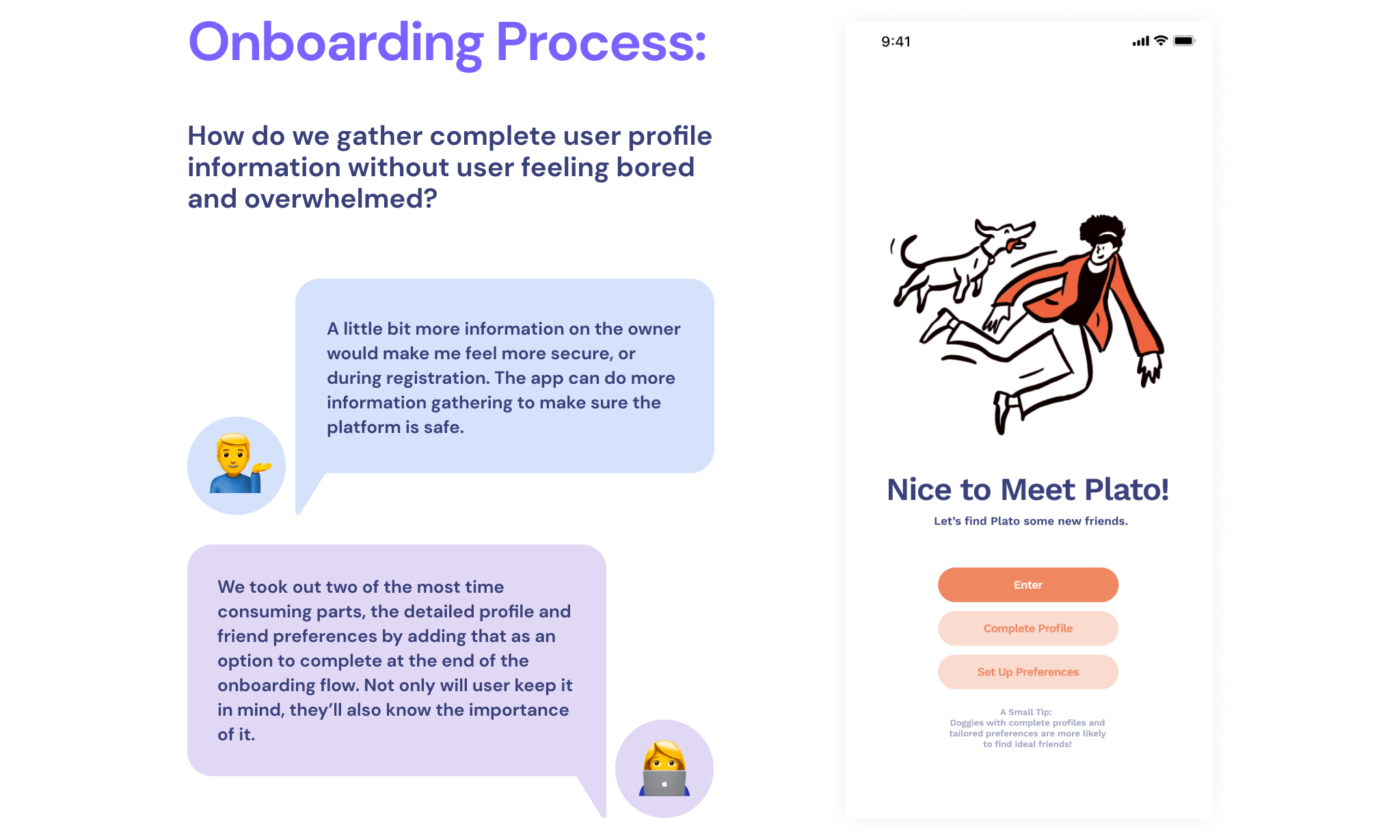
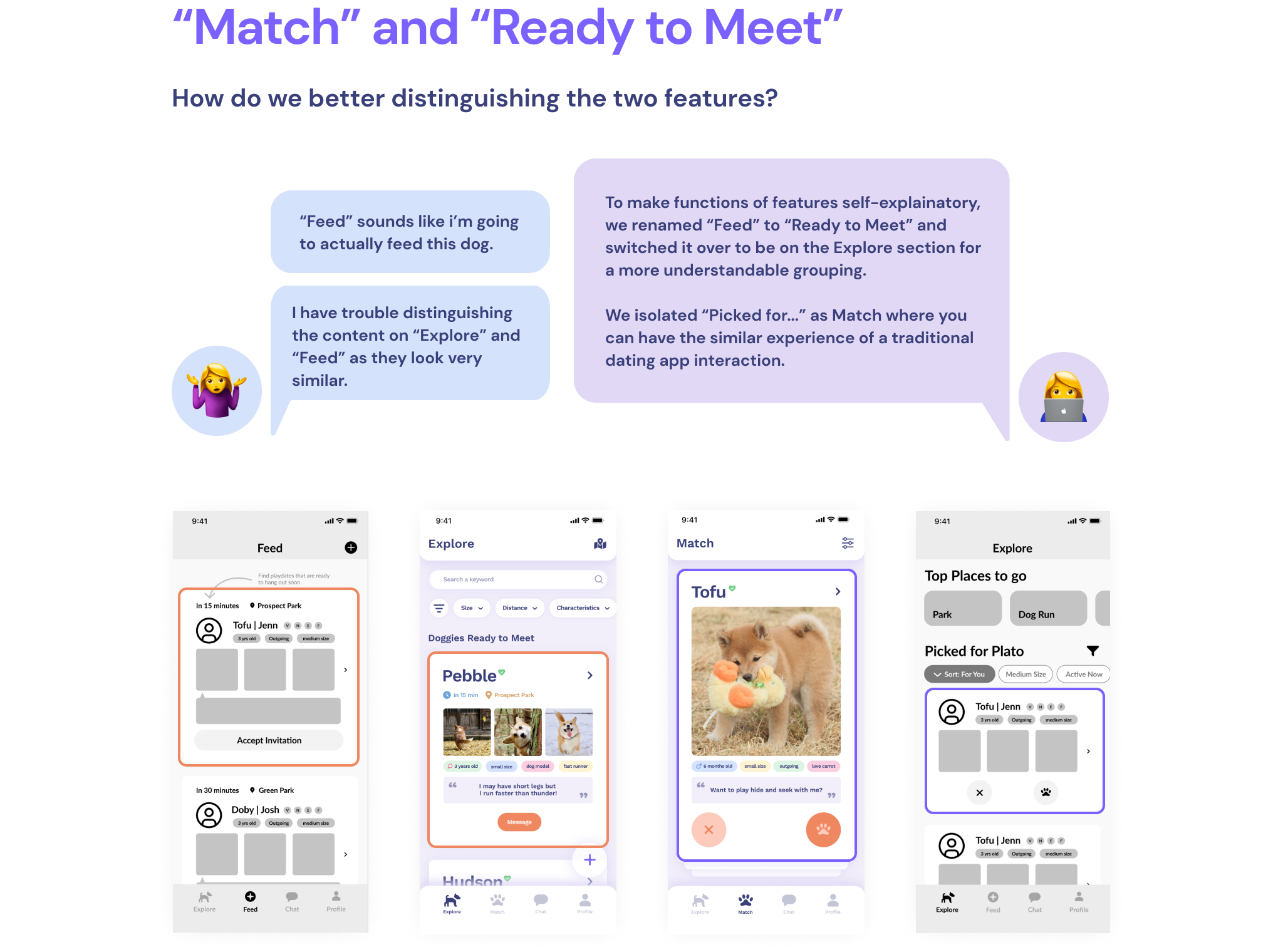
From user testing with 8 participants on our mid-fidelity prototype, we synthesized findings that contributed to three main changes to be made.
