The Met Museum
Eye Tracking Study
Enhancing the browsing experience from eye tracking insights.BACKGROUND
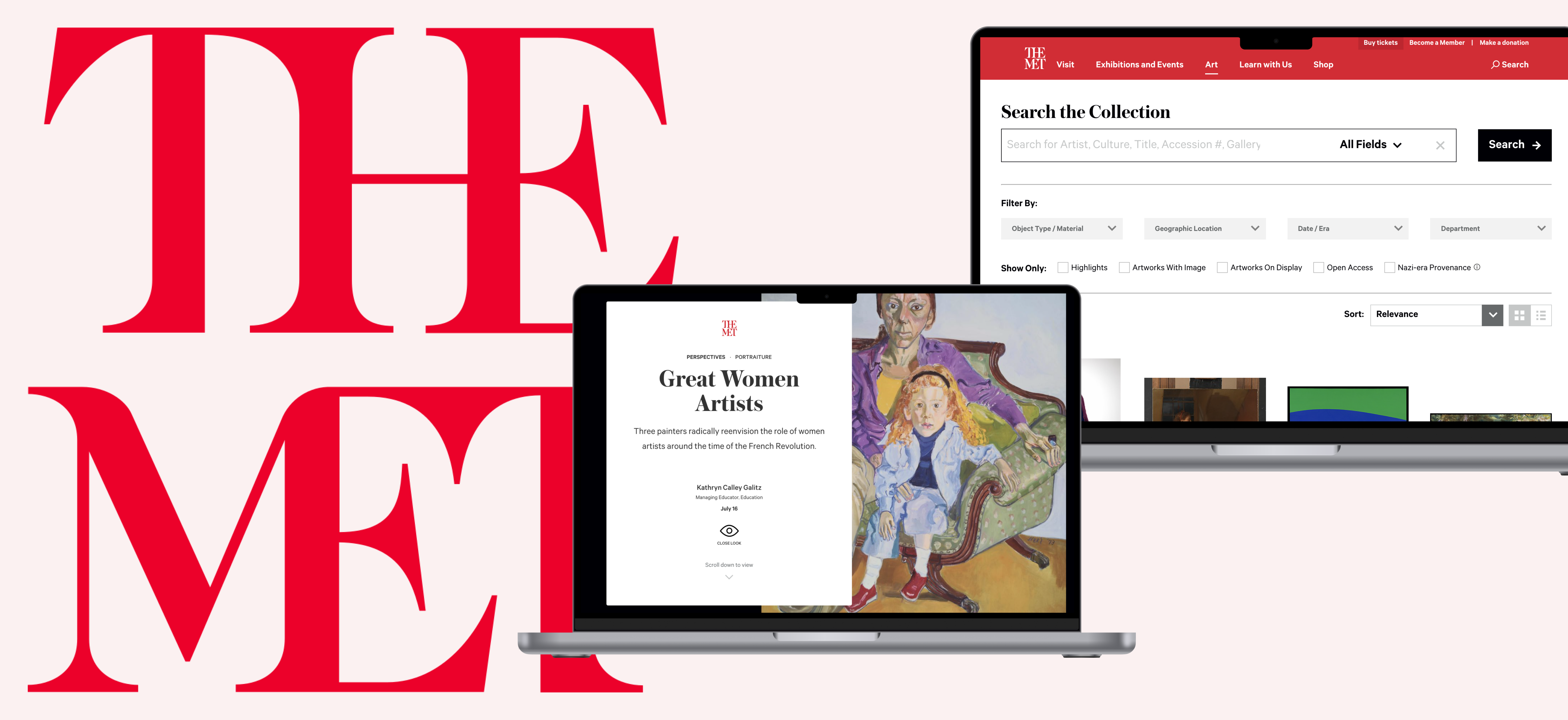
The Met Museum is one of the most well-known art museums that houses hundreds of thousands of artwork from ancient to contemporary era. It is an institution that not only showcases artworks but also educates people about artworks in a variety of ways. Using eye tracking technology with Tobii,my team studied the experiences of the Close Look articles and the Collection search, and how our users were interacting with them.
View Our Full Presentation Deck
REMOTE TEAMMATES
Chris Denney, Kyle Kisicki, Mayank Gupta, Raunak Jangid
REMOTE TEAMMATES
Chris Denney, Kyle Kisicki, Mayank Gupta, Raunak Jangid
ROLE
User Research, Eye Tracking Study, Usability Testing
TOOLS
Tobii Pro X2, Tobii Pro Lab, Adobe Premier
DURATION
2 months
User Research, Eye Tracking Study, Usability Testing
TOOLS
Tobii Pro X2, Tobii Pro Lab, Adobe Premier
DURATION
2 months
EVERYONE INVOLVED
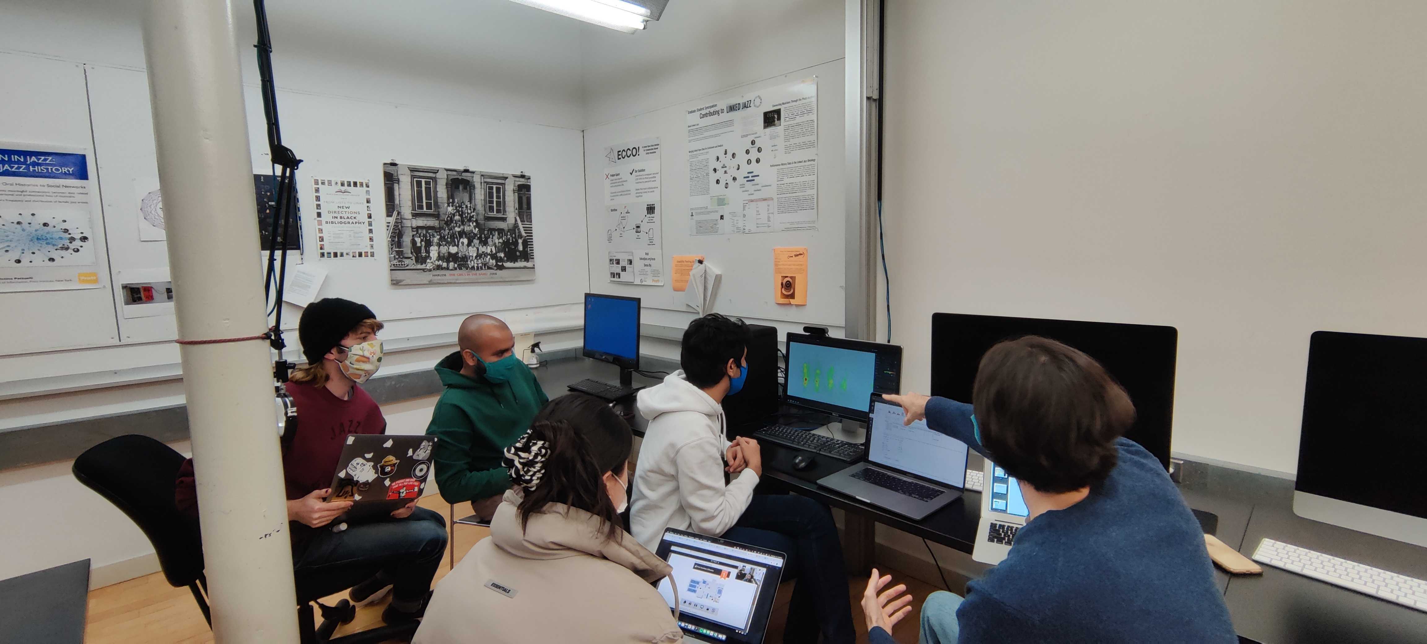
We are a group of 5 research students from the IXD program at Pratt Institute. We conducted 10 in-person moderated eye-tracking studies using Tobii Pro X2 and analyzed the data with Tobii Pro Lab.
We recruited our participants via Pratt’s internal email. Our Participants were 7 graduates, 2 undergraduates, and 1 unaffiliated participant. They had a range of interests in art between highly interested and somewhat interested.
ABOUT OUR STUDY
Before Test:
During Test:
After Test:
- We first asked some pre-test questions to gather their general information.
- We used eye calibration to get the most accurate result.
During Test:
- We have a total of 3 tasks. For each of them, we asks our users to first complete the task silently, then we ask them a follow up question about what interests them the most.
After Test:
- We invited our users to watch the recordings with us and encourage them to think-aloud and explain their actions and thoughts.
- Lastly, we asked them to complete the post-test questionnaire with the System Usability Score to rate the experience.
Analyzing Data in Tobii
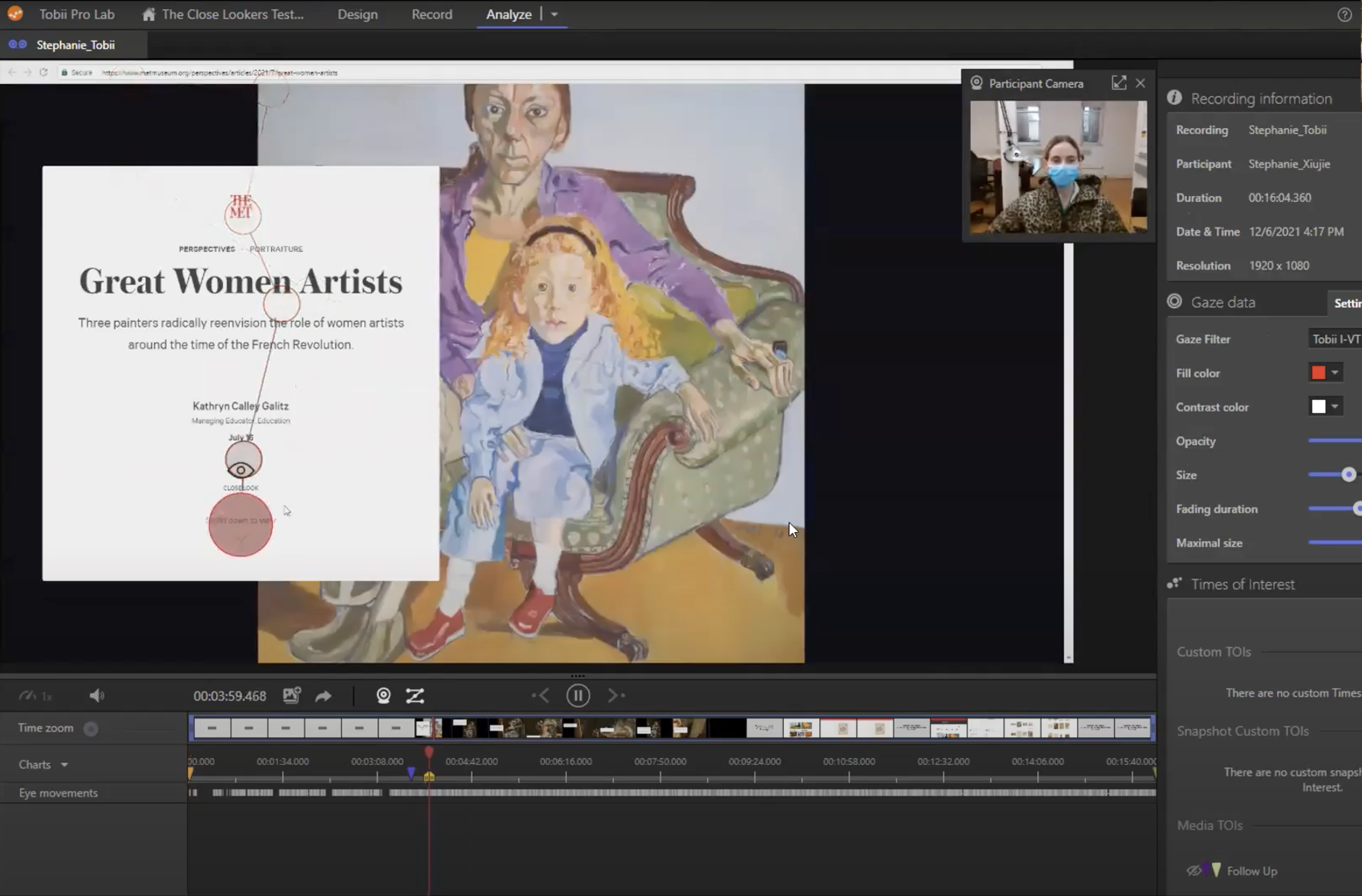

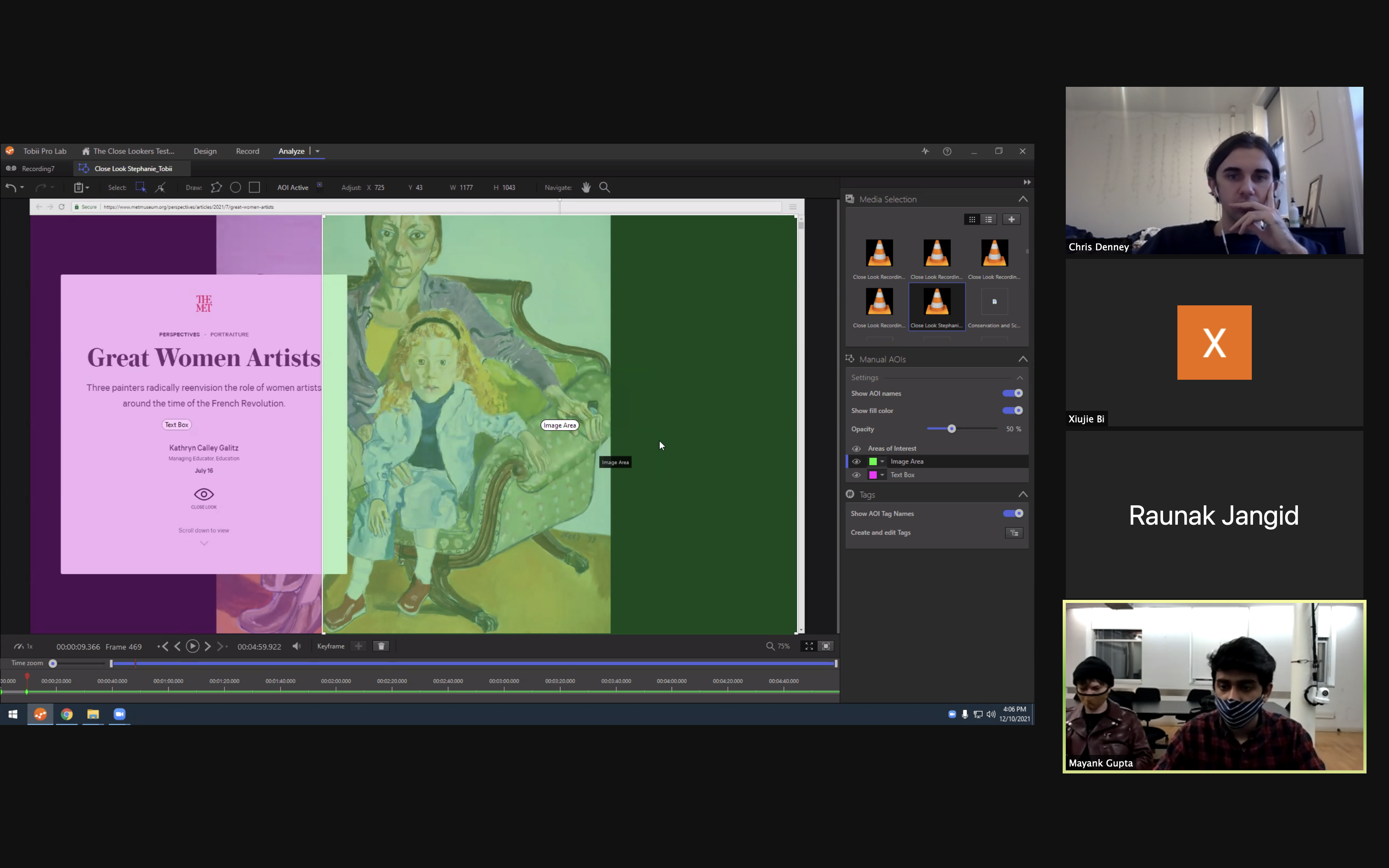
With different features within Tobii, we were able to turn our users’ eye movements into useful quantitative data and qualitative data.
Quantitative data includes:
Qualitative Data includes:
Quantitative data includes:
- Areas of Interest (AOI): setting areas to find out where our users where focusing on the most.
- Time of Interest (TOI): observing how our users behave within a certain time frame.
- Heatmaps: visualizing where our users were focusing on the most.
- Fixation Points: where our users looked at.
- Gazeplots: the trace of our users’ eye movements.
Qualitative Data includes:
- Real time observations while our users were completing the tasks.
- Video walkthrough and debrief together with users to gather their thoughts and reasons behind their actions. Watch Highlight Reel Here.
Our Study Objectives
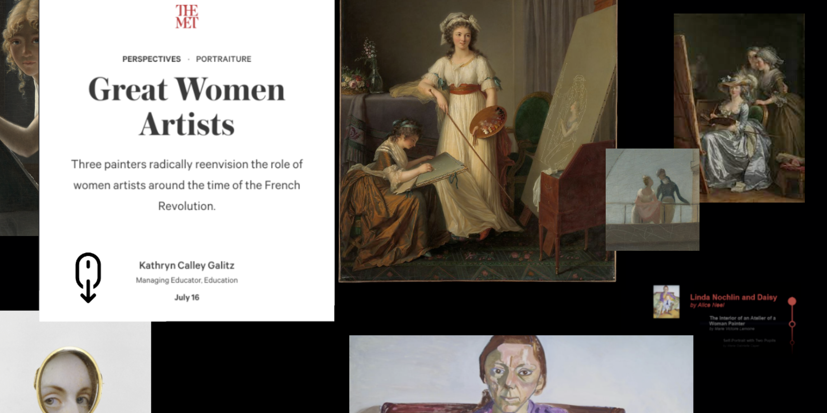
THE CLOSE LOOK ARTICLE
- How do readers consume and prioritize the text and visual content within the article?
- Are articles successful in guiding a user’s visual focus?
THE COLLECTION SEARCH EXPERIENCE
- What patterns can we see in how they engage with the works of art, the information about it, and the UI elements that the collection search provides?
- What, if any, differences can be seen between users searching for a specific artwork versus generally browsing?
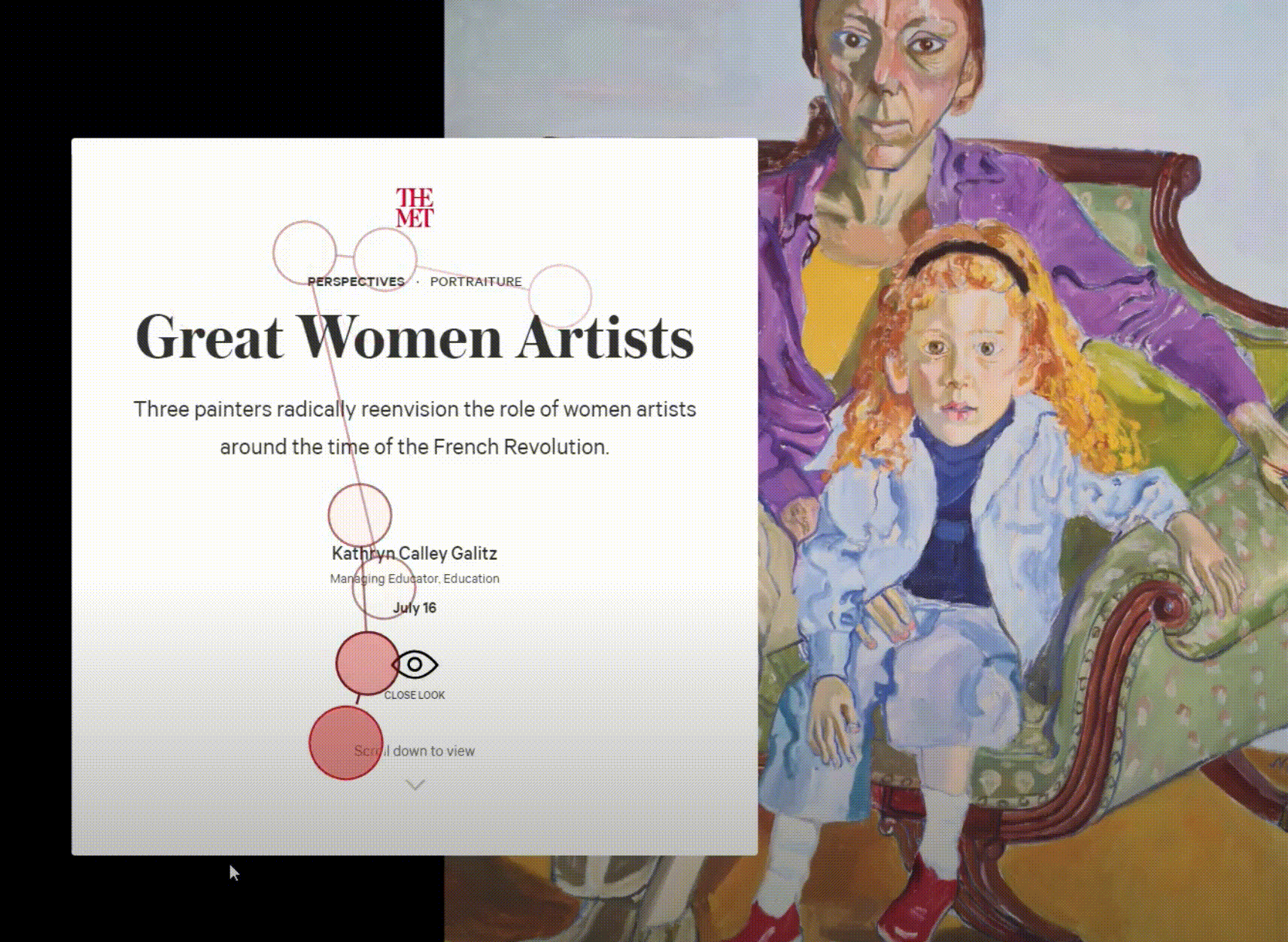
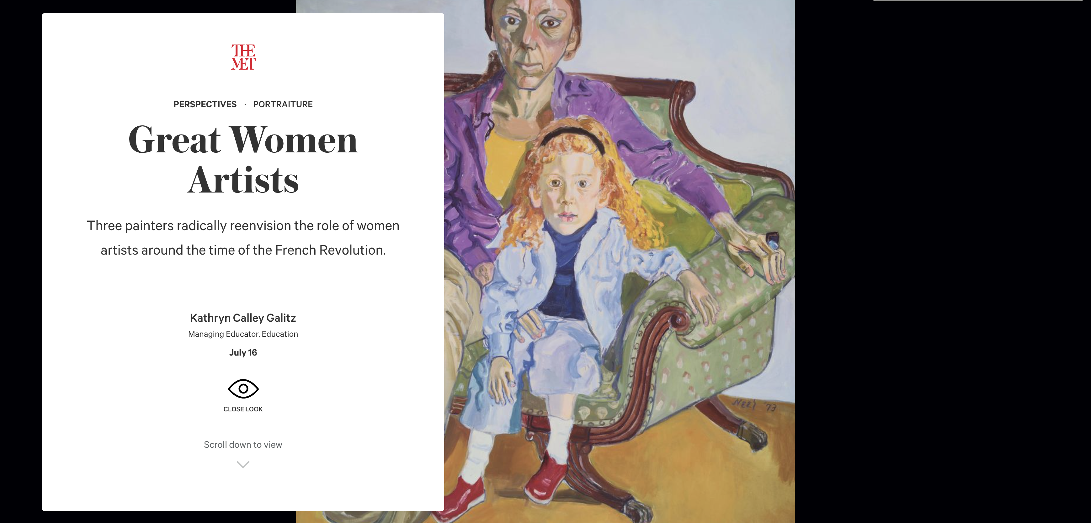
Guiding Users Through the Immersive Close Look Experience
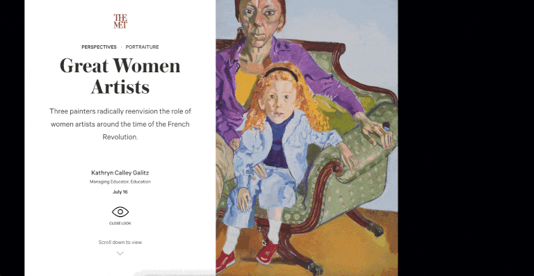
For the first task, we asked our users to browse the page as they normally would, giving them a 5-minute limit. We want to see how they would browse this page freely without any directions from us.
Using Area of Interest to Analyze User’s Focus

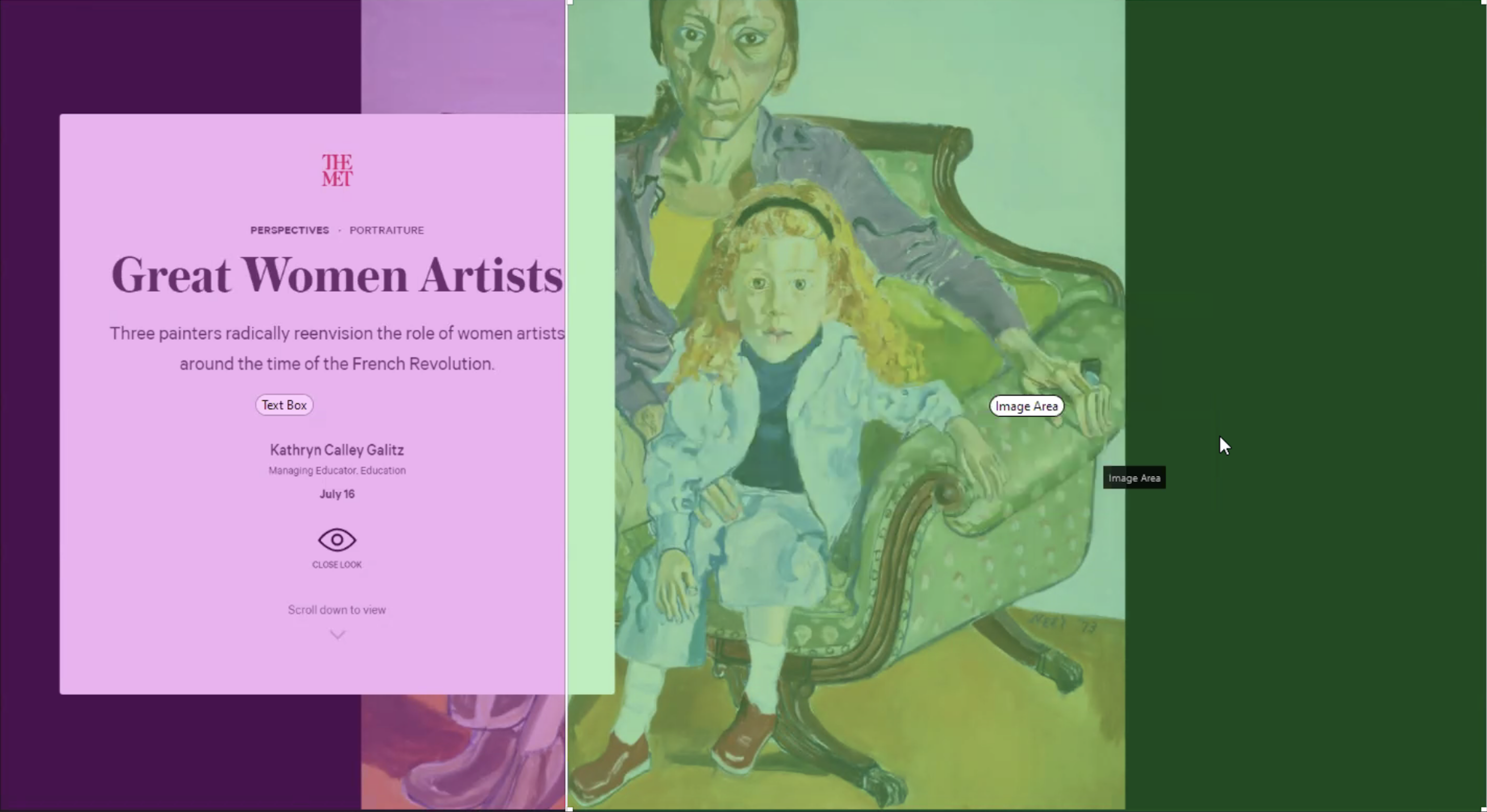
Within Tobii Lab, we set two separated areas for text and images to look at the total time of our users consuming each area. As a result, we found that with an average fixation time on the page, they spent an average of 58.41 seconds looking at the images, and 163.93 seconds looking at the text.
This was probably because of the amount of textual information on the page exceeding the images. For some images, our users would take a quick glance at them and continue reading the text.
This was probably because of the amount of textual information on the page exceeding the images. For some images, our users would take a quick glance at them and continue reading the text.
Providing users with better guidance throughout the immersive, educational experience
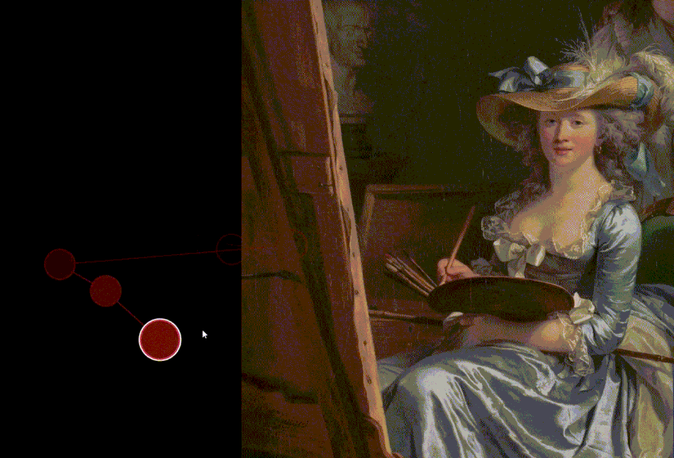
“It was interesting how when the text was referencing a part of the piece…it would kind of zoom in on that. It’s not like you have to look for it, they’re already showing you it. I like that as well. It allows for better understanding.”
– Participant A
The Close Look experience was successfully guiding our users in a simple to follow way, encouraging them to learn more about these artworks.
However, due to the amount of detailed content about the artworks, the page scroll is very long. It can be super engaging for some of our users who are art enthusiasts. For others, they did lose interest in reading.
 “I moved my head here because I was starting to get tired of reading. I probably would have paused here had I not been doing this for you guys. It just felt like a lot of scrolling at this point.”
– Participant O
We recommend adding a navigation control with a thumbnail and name of the artwork on the right side. This way users are able to get an overview of the content of this page, and jump to the section they’re interested in if needed.
Clarifying Interactive Elements and User Actions to Kick Start the Reading
 “[I clicked the icons because] I wanted to see if there was anything interactive on the website. I didn’t know what to expect.”
– Participant A
While there is only one user action they need to complete for this page — scrolling down, many of our users struggled to understand what to do on the first screen to begin reading the article. As there was a lot of content with different hierarchies, it took them a while to wrap their heads around it.
The eye icon and the arrow icon seemed interactive to some users, hence some of them tried to click on the icons. However, these icons are not interactive, making the first screen seem static.
The eye icon and the arrow icon seemed interactive to some users, hence some of them tried to click on the icons. However, these icons are not interactive, making the first screen seem static.
To shorten the response time and better inform our users on the first screen, we reconsidered the visual hierarchy for icons and prioritized the scroll down action to make it straightforward. We recommend making the scroll down icon interactive, when users click on the icon the page will scroll down for them, similar to uses in many websites today.
To make indications of content below the fold, it would also be helpful to place content that passes beyond the fold as a hint. Parallax scrolling will also add depth and make the page more immersive.
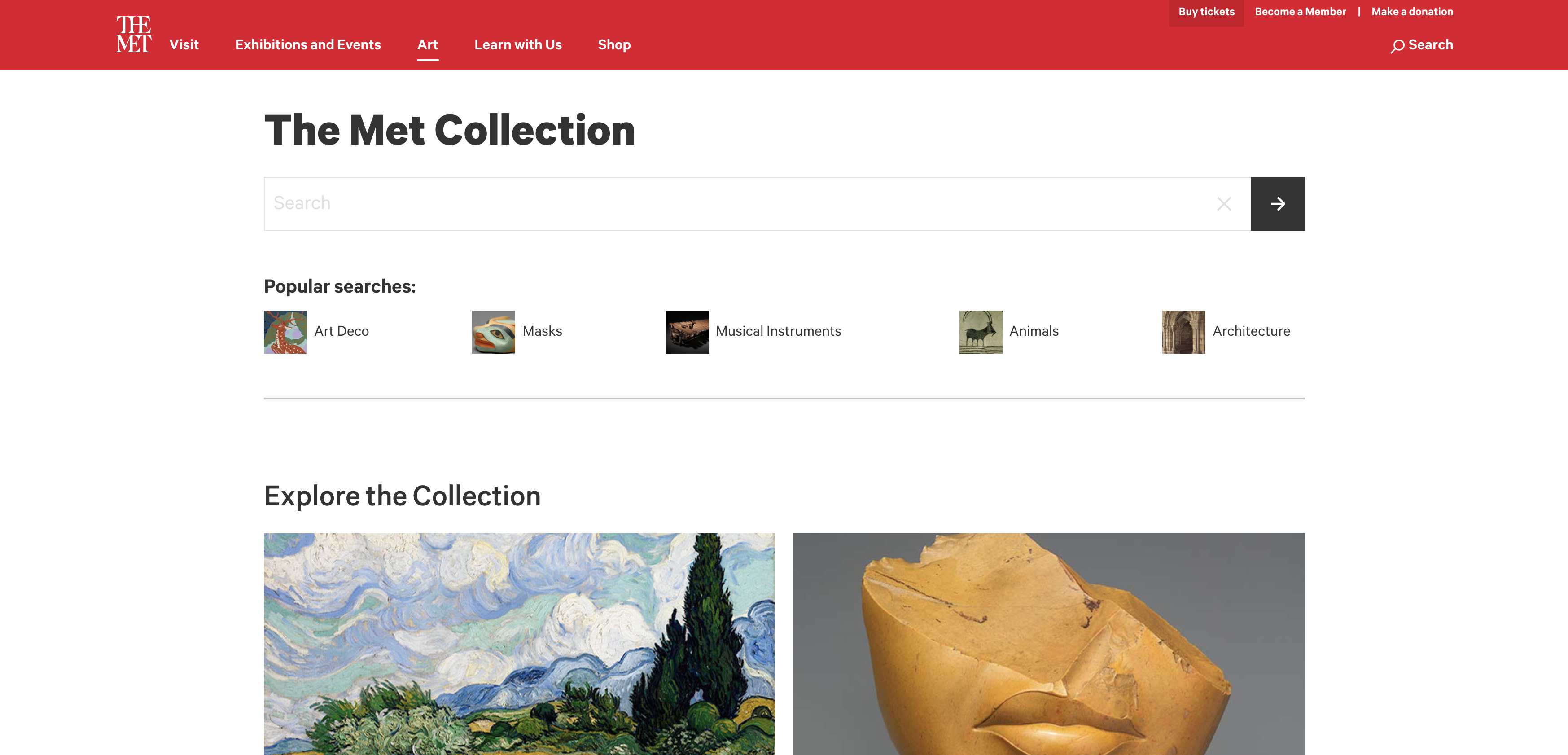
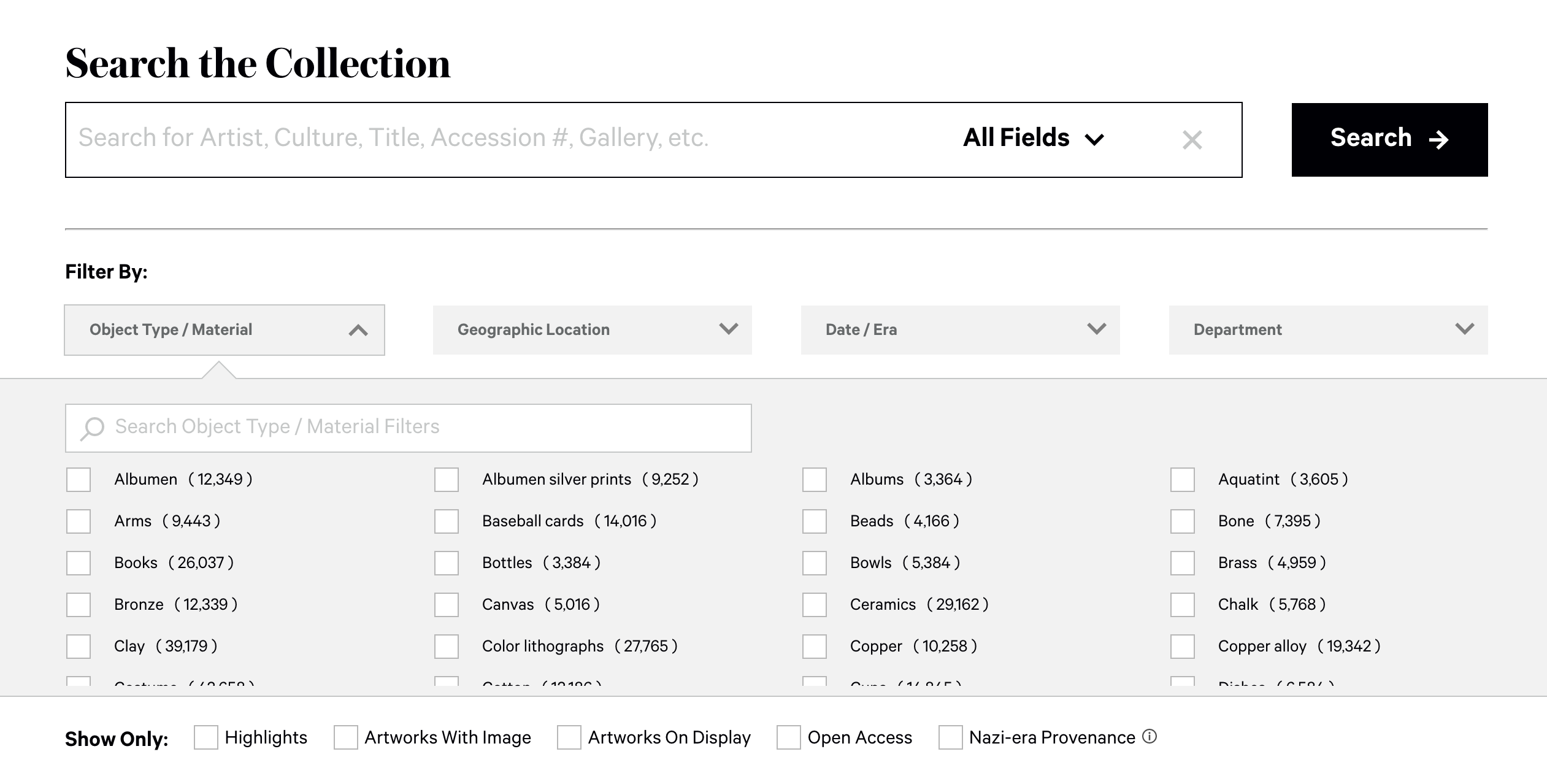
Observing the Collection Search Experience
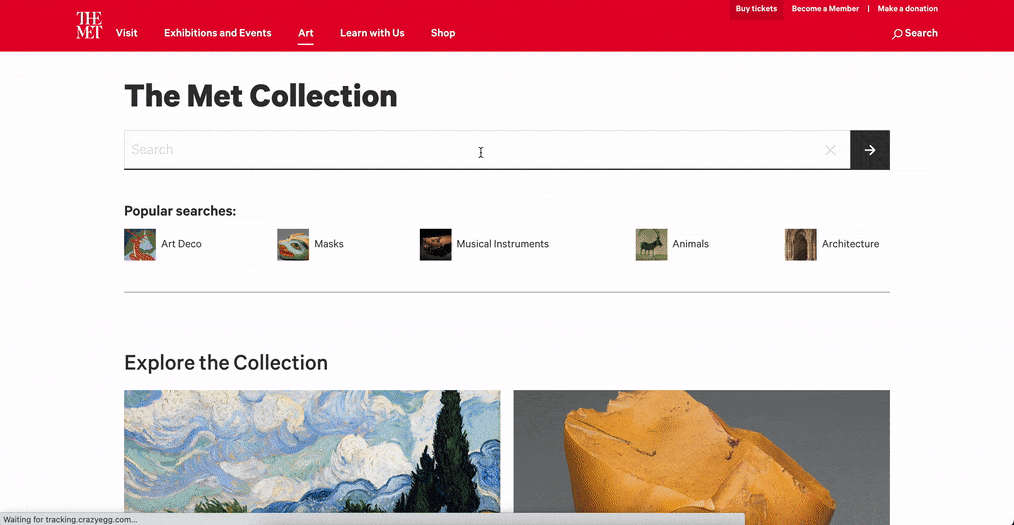
The Collection page houses every artwork in a catalog format, with a detailed description page for each.
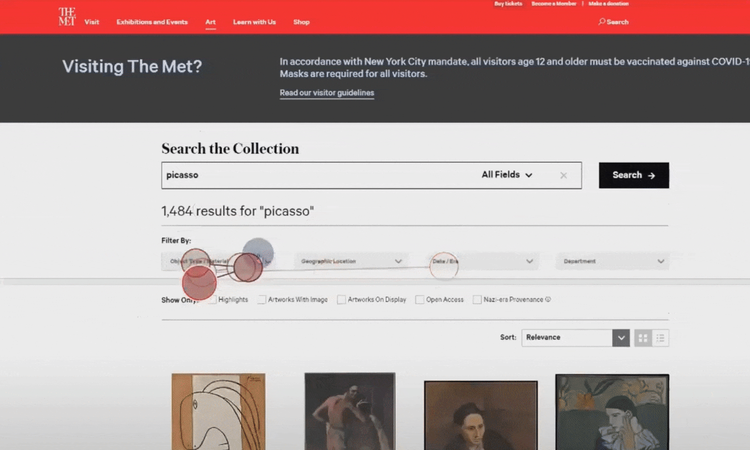
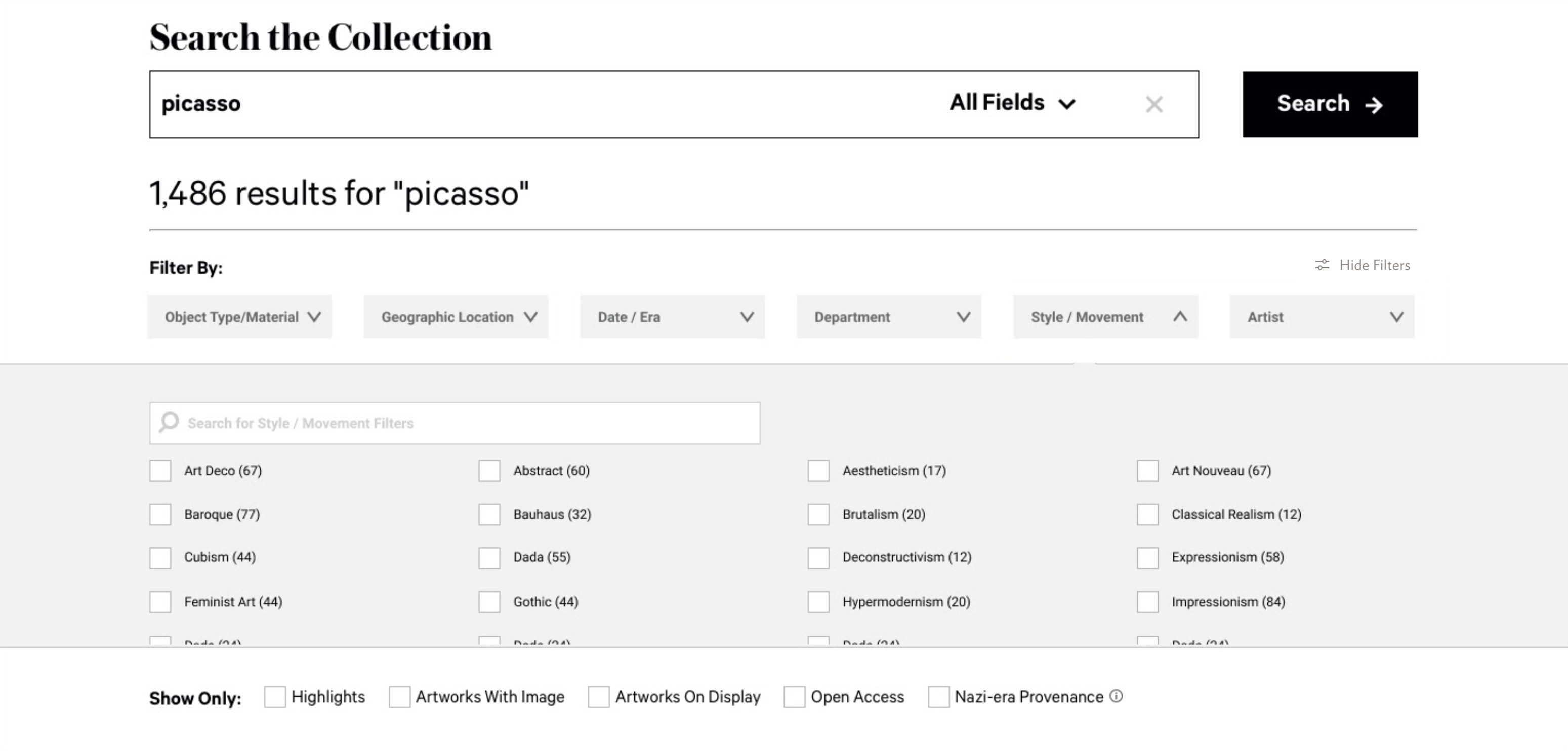
For task 3 and 4, we wanted to observe how our users browse randomly versus how they browse for a specific artwork. We asked our users to spend five minutes each to browse for one that interests them, and browse for a cubism style graphite drawing from Pablo Picasso.
Providing users with better guidance throughout the immersive, educational experience
While looking for a particular art, artist, period etc. our users started by searching for the name, and filtering for the specific criteria. The filter search bar came in handy for many of our users and provided quick access for any specific filters.
“As soon as I started, I used search cause it was easier when searching within a catalog. I tend to do that when websites provide it.”
– Participant S
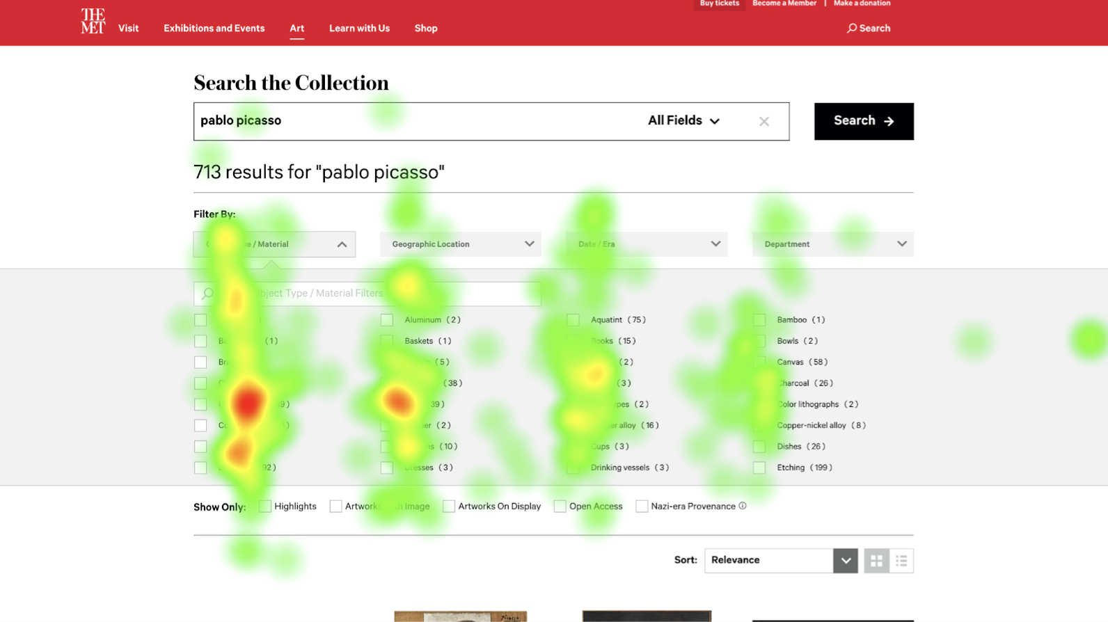
However, despite the convenience of the search bar, users found it difficult to locate the filter without using search. They were mainly skimming vertically while the filters are ordered alphabetically and horizontally.
This can also be caused by how filters are grouped closely vertically. As a result, it took a while for some of our users to locate the filter for graphite with the unfamiliar arrangement.
As the heat map is showing, there is a rotated F shape reading pattern, which is the most commonly found reading order. Few of them paid attention to the two columns on the right side.
We recommend arranging filters in vertical alphabetical columns, along with anchor tags to allow the users to jump to a specific alphabet and quickly locate the item.
Expanding Filter Types According to User Needs
When asking them to choose an artwork in the cubism style, many of them didn’t know where to find that criteria with the filter categories. Some of them tried to look into “era”, or “artist/culture” but didn’t find what they were looking for. Some of them even had to read through individual artwork descriptions to confirm if they are cubism style. This can be troublesome for many people if they are looking for a specific style, but are not familiar with it visually.
“[I’m filtering for] “paintings, but I didn’t see that specifically.”
-Participant A
“I was looking for ‘Artists’ ‘I wanted to see if there was a category for ‘big artists’.” (within the “Art” dropdown)
“I was looking at era”….expected to find something like ‘cubism’ there.”
– Participant O
-Participant A
“I was looking for ‘Artists’ ‘I wanted to see if there was a category for ‘big artists’.” (within the “Art” dropdown)
“I was looking at era”….expected to find something like ‘cubism’ there.”
– Participant O
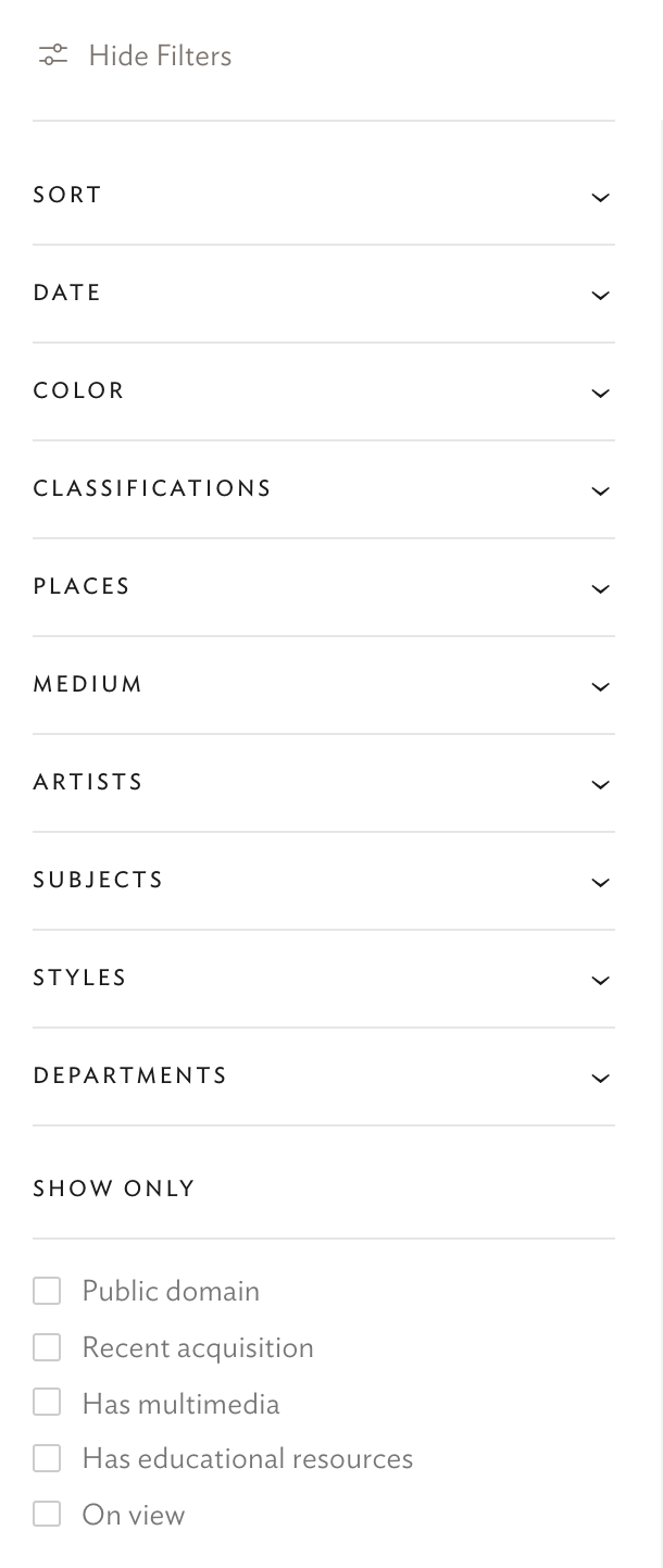
We looked at similar collection searches from the Art Institute of Chicago. They had a very complete list of filters that can help users get started.
To make the searching more intuitive and easier for our users, we recommend adding “Artist” and “Style/Movement” filters to the list. Additionally, a “hide filter” button would be helpful as an option to reduce visual clutter.
Conclusion
This eye-tracking study gave us close insights into how users actually interact with the website. Note that in a testing scenario, our users may be performing slightly differently than they normally would on their own. We have tried our best to set a comfortable and encouraging environment for them to open up and perform truly.
Our guest critics, three product designers from Met where pleasantly surprised by how we were able to used both qualitative and quantitative data from eye tracking to measure success and spot opportunities for the Close Look article. As it is a fairly new project, they haven’t experimented with it a lot, therefore, our insights were super helpul for them.
The findings on the organization of the filters were also a highlight emphasized by the guest critics. The heatmap and recording communciated how certain layout can change user behavior. Our guest said that he has never thought of it before and “It’s super interesting to see how people actually use our filters.”
Our team has learned so much from designing, moderating, and analyzing the tests and I hope that this findings and recommendations will help create an even better and intuitive user experience for the Met website.
 Presentation day where we present to the product designers at Met.